| Topic | Key Takeaway |
|---|---|
| The 1-Second Rule | Shoppers decide to click or scroll in under 1.2 seconds; your cover is a visual "yes/no" filter. |
| Thumbnail Optimization | Most KDP sales happen on mobile; if your title isn't legible at 100px wide, you are losing 60%+ of sales. |
| Genre Expectations | Breaking genre tropes doesn't make you "unique"; it makes you "invisible" to your target audience. |
| Typography | Font choice conveys more emotion than the image itself; avoid "system fonts" like Times New Roman or Comic Sans. |
| Technical Accuracy | KDP requirements (300 DPI, bleed, spine math) are non-negotiable for print-on-demand quality. |
In the world of Amazon KDP, your book cover is not art—it is a high-performance marketing asset. You have likely heard the old adage "don’t judge a book by its cover," but the reality of the Amazon algorithm is the exact opposite. Statistics from top-tier publishing analysts suggest that a professional cover can increase a book’s click-through rate (CTR) by over 300% compared to a DIY effort. When a reader scrolls through a search result page, they aren't looking for a "good" book yet; they are looking for a reason to stop scrolling.
The hard truth is that a mediocre cover will kill even the most well-written manuscript. If your cover looks "indie" (in the derogatory sense), readers subconsciously associate that visual quality with poor editing and a weak story. In this guide, we will strip away the fluff and look at the hard data, technical requirements, and psychological triggers that turn a browsing shopper into a paying customer.
1. The Psychology of the Click: The "Thumbnail Test"
Most KDP authors design their covers on a 27-inch monitor, viewing the artwork in full-screen glory. This is a critical mistake. Over 65% of Amazon shoppers browse via the mobile app or mobile browser. On these screens, your cover is roughly the size of a postage stamp.
The Visual Hierarchy
A high-converting KDP cover follows a strict visual hierarchy. The human eye follows a specific path when scanning a thumbnail:
- The Hook (The Image/Icon): This sets the mood. It tells the reader if the book is a dark thriller, a lighthearted romance, or a serious business manual.
- The Title: This must be the most legible text element. It needs high contrast against the background.
- The Subtitle/Author Name: These are secondary. If they aren't legible in the thumbnail, it’s acceptable, provided the main hook and title did their job of getting the click.
Contrast and Color Theory
In 2026, the Amazon marketplace is more crowded than ever. To stand out, you need "pop," but not "noise."
- Complementary Colors: Using colors on opposite sides of the color wheel (e.g., orange and teal) creates natural tension that draws the eye.
- The 60-30-10 Rule: Use a dominant color for 60% of the cover, a secondary color for 30%, and an accent color for the remaining 10% (usually for the "Hook" or the author's name).
- Brightness vs. Saturation: High saturation can look "cheap." Instead, focus on value contrast—the difference between the darkest and lightest parts of the image.
2. Genre Conventions: Why "Unique" Often Means "Unsold"
One of the biggest conversion killers is the desire to be "totally original." While you want your book to stand out, you must first signal to the reader that your book belongs in their preferred category. This is known as "Genre Signaling."
Fiction vs. Non-Fiction Standards
The design language for fiction and non-fiction is diametrically opposed.
- Fiction (Emotional Sell): Focuses on atmosphere. Typography is often integrated into the artwork. For example, Cozy Mysteries require bright, illustrated, "busy" covers with sans-serif fonts. Epic Fantasy requires serif fonts with metallic textures and sprawling landscapes.
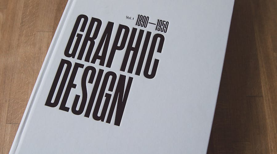
- Non-Fiction (Authority Sell): Focuses on the "Result." Typography is the star. Think big, bold, clean fonts (like Montserrat or Bebas Neue). High-contrast backgrounds (white or deep navy) signal professionalism and authority.
Analyzing the "Big Three" Genres
- Romance: Focuses on character chemistry. Modern trends lean toward "illustrated" characters for rom-coms and "moody photography" for dark romance.
- Thrillers: High contrast. Red, black, and white are the standard palette. Thin, sharp fonts or heavy, "impact" fonts work best.
- Self-Help/Business: Cleanliness is king. Minimalist designs with one central icon outperform cluttered covers.
| Feature | Amateur/DIY Cover | Professional/High-Converting Cover | Resulting Conversion Impact |
|---|---|---|---|
| Typography | Uses standard fonts (Arial, Papyrus) with drop shadows. | Uses premium, licensed fonts with custom kerning. | Pro fonts increase perceived value by 40-50%. |
| Image Quality | Low-resolution (72 DPI) or stretched images. | 300 DPI, high-resolution, layered compositions. | Prevents "blurriness" on high-res Kindle screens. |
| Title Placement | Small, centered in the middle, obscured by art. | Large, top or bottom third, 100% legible at thumbnail size. | Higher CTR (Click-Through Rate) in search results. |
| Color Palette | Too many colors (5+), clashing tones. | Restricted palette (2-3 main colors) with high contrast. | Focuses the reader's eye on the "Hook" immediately. |
3. Technical Requirements and Common Pitfalls
Even the most beautiful design will fail if it doesn't meet Amazon’s strict technical KDP cover requirements. If your dimensions are off by even 1/8th of an inch, your book may be rejected, or worse, printed with white streaks on the edges.
Resolution and Color Space
- 300 DPI (Dots Per Inch): This is the industry standard for print. Anything less will look pixelated when printed. For eBooks, 72 DPI is technically acceptable, but 300 DPI ensures clarity on high-density Retina displays.
- CMYK vs. RGB: Design your paperback cover in CMYK (for print). Design your eBook in RGB (for screens). If you use RGB for a paperback, your vibrant blues and greens will look dull and "muddy" when the physical book arrives.
The Anatomy of a Paperback Cover
When designing a physical book, you aren't just designing a front. You are designing a "Wrap."
- Bleed: You must extend your background image 0.125 inches (3mm) beyond the trim line. This ensures that if the printer's blade slips slightly, there isn't a white line at the edge of your book.
- The Spine: This is the most overlooked part of KDP design. The spine width depends entirely on your page count and paper type (white vs. cream). Amazon provides a calculator, but tools like ZenEbookAI can automate these calculations to ensure your spine text is perfectly centered.
- The Barcode: Leave a 2" x 1.2" space on the bottom right of your back cover. Do not place essential text or faces there, as Amazon will slap a barcode over it.
KDP Trim Sizes
While 6x9 inches is the "standard" for US trade paperbacks, it’s not always the right choice.
- 5.5x8.5: Better for shorter non-fiction or memoirs.
- 5x8: Popular for mass-market fiction.
- 8.5x11: Standard for workbooks and journals. Selecting the wrong trim size can make your book feel "too thin" or "too bulky" in a reader's hand, leading to negative reviews about "production quality."
4. What Kills Conversions: The "Instant Skip" Triggers
After analyzing thousands of listings, certain "red flags" consistently lead to high bounce rates. If your cover has any of the following, you are likely burning your ad spend.
The "Floating Head" Syndrome
In fiction, placing a poorly cropped head of a stock photo model onto a generic background is a hallmark of an amateur. Unless you are a master of Photoshop blending (lighting, shadows, color grading), avoid complex "photobashing." Instead, opt for a single, powerful image or a clean, symbolic illustration.
Text-on-Image Visibility
If your title is "The Secret of the Woods" and you place dark green text over a photo of a dark forest, your book is invisible.
- The Solution: Use a "scrim" (a subtle dark gradient behind the text) or a "backing element" (a box or shape) to separate the typography from the background.
- ZenEbookAI Tip: Our platform utilizes smart-contrast detection to suggest font colors that remain visible regardless of the complexity of the background art.
The "Kitchen Sink" Approach
Some authors try to put the whole story on the cover. They include the protagonist, the villain, the magic sword, the castle, and the pet dragon. This creates visual clutter. A cover should represent a theme or a singular moment of tension, not a plot summary. The most successful covers in 2026 are leaning toward "Minimalist Impact"—one strong focal point that forces the reader to wonder "What is this about?"
5. Staying Competitive with Modern Tools
The barrier to entry for KDP publishing has never been lower, but the bar for "professional quality" has never been higher. You are no longer competing with just other indie authors; you are competing with traditional publishing houses with million-dollar design budgets.
The Role of AI in 2026 Design
We are past the era where "AI-generated" meant distorted limbs and melting backgrounds. Modern KDP authors use AI to iterate. Instead of spending $500 on a single cover that might not even convert, authors use ZenEbookAI to generate multiple concepts based on high-converting genre templates.
This allows for A/B testing—a process where you run two different covers for the same book to see which one gets more clicks. In the current market, "data-driven design" beats "artistic intuition" every time.
Formatting for "Read-Through"
A cover isn't just for the front. The back cover matter (the blurb) needs to be formatted with massive amounts of white space. Long, dense paragraphs on a back cover are a "conversion killer." Use:
- Bolded "hook" lines.
- Bullet points for "What you will learn" (for non-fiction).
- Short, punchy paragraphs (2-3 sentences max).
Frequently Asked Questions
Q: Should I use a photo or an illustration for my KDP cover? A: This is entirely genre-dependent. For Memoirs, Business, and Steamy Romance, photography usually converts better as it feels "real." For Fantasy, Sci-Fi, and Rom-Coms, illustrations (whether digital or vector) are the current market standard. Check the top 100 in your specific sub-category on Amazon to see the prevailing trend.
Q: How much should I expect to pay for a professional KDP cover? A: A custom-designed cover from a high-end designer ranges from $300 to $1,000. Premade covers usually cost $50 to $150. However, using a specialized tool like ZenEbookAI allows you to create pro-level designs for a fraction of that cost, giving you more budget to spend on Amazon Ads.
Q: Can I change my cover after the book is published? A: Yes! In fact, you should. If your book has been out for 3 months and isn't selling despite getting impressions, your cover is the problem. You can upload a new cover file in your KDP dashboard at any time. It usually takes 24-72 hours for the change to reflect on the Amazon storefront.
Q: Does the spine text really matter? A: For your Amazon sales page, no. For the reader’s bookshelf, yes. A poorly aligned spine reflects poorly on your brand as an author. If you plan on doing any local bookstore signings or library placements, the spine is the only thing the customer sees first.
Final Thoughts
Design is the silent salesperson of your KDP business. You can write the next great American novel or a world-changing business strategy, but if your cover looks like a relic from 1998, no one will ever read the first page.
To maximize your KDP success in 2026, follow these three actionable steps:
- Audit your competition: Find the top 5 books in your niche and identify their shared design elements (fonts, colors, imagery).
- Optimize for the Thumbnail: Always view your design at 10% zoom. If you can’t read the title or distinguish the main image, start over.
- Use Professional Assets: Don't settle for "good enough." Utilize platforms like ZenEbookAI to ensure your technical specs are perfect and your aesthetic matches the high standards of the modern Amazon shopper.
Your cover is an investment, not an expense. Treat it with the same level of care as your writing, and the Amazon algorithm will reward you with the visibility your work deserves.
Related guides to continue
- Amazon KDP for Beginners: Everything You Need to Know Before Publishing Your First Book
- How to Publish on Amazon KDP in 2026: The Complete Step-by-Step Guide
- KDP Niche Research in 2026: How to Find commercially viable niches Before They Saturate
Use these guides to connect niche validation, manuscript preparation, cover quality, metadata, and launch decisions before publishing.